Design Widgets
Here you'll find widgets that are primarily used to make the page's content more visually appealing and to break up the layout a bit.
Accordion
Accordions can be used to hide content that is only displayed when you click on it. This allows you, for example, to break up a page with a lot of text by ensuring that not too much text is visible at once.
You can insert a wide variety of widgets into the accordion itself, not just text. For example, you can also use images in the accordion.


Boxes
The Box widget allows you to visually group page content. This text and its heading are contained within a single box with a gray background. Of course, all content can also be inserted onto the page without a box behind it, such as the dividers between the boxes on this page.
Columns
Columns can be used to display content side by side. The number of columns can be adjusted.
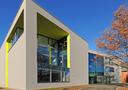
Here, two columns are used: one filled with text and the other with an image.

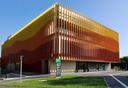
Columns are a great way to display multiple images on a page, like a photo gallery.


Tab Widget
The tab widget basically works the same way as the accordions. Instead of expanding the content, however, you switch between tabs, so that only the content of the selected tab is displayed at any given time.
The tab widget basically works the same way as the accordions. Instead of expanding the content, however, you switch between tabs, so that only the content of the selected tab is displayed at any given time.
Both the Accordion and Tab widgets offer the option to add icons and select a suitable one from a predefined list in the widget properties. To do this, however, you must set “Show Icons” to Yes in the properties.
Both the Accordion and Tab widgets offer the option to add icons and select a suitable one from a predefined list in the widget properties. To do this, however, you must set “Show Icons” to Yes in the properties.
In addition to text, a wide variety of widgets can also be used in the tabs.

In addition to text, a wide variety of widgets can also be used in the tabs.
The tab widget basically works the same way as the accordions. Instead of expanding the content, however, you switch between tabs, so that only the content of the selected tab is displayed at any given time.
Both the Accordion and Tab widgets offer the option to add icons and select a suitable one from a predefined list in the widget properties. To do this, however, you must set “Show Icons” to Yes in the properties.
In addition to text, a wide variety of widgets can also be used in the tabs.
Definition List
Definition lists are particularly well-suited for presenting content with specific relationships.
Person 1
- Contact
- Responsibilities
Person 2
- Contact
- Responsibilites
Person 3
- Contact
- Responsibilities